
How I built this site with Nuxt and Vue and kept Lighthouse at 100


This is the PageSpeed report for my home page on a phone.
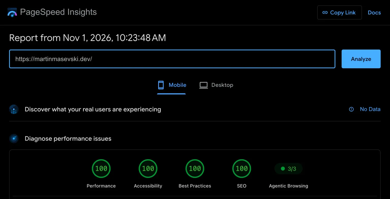 Mobile PageSpeed for my home page: four 100s on the harder of the two tests.
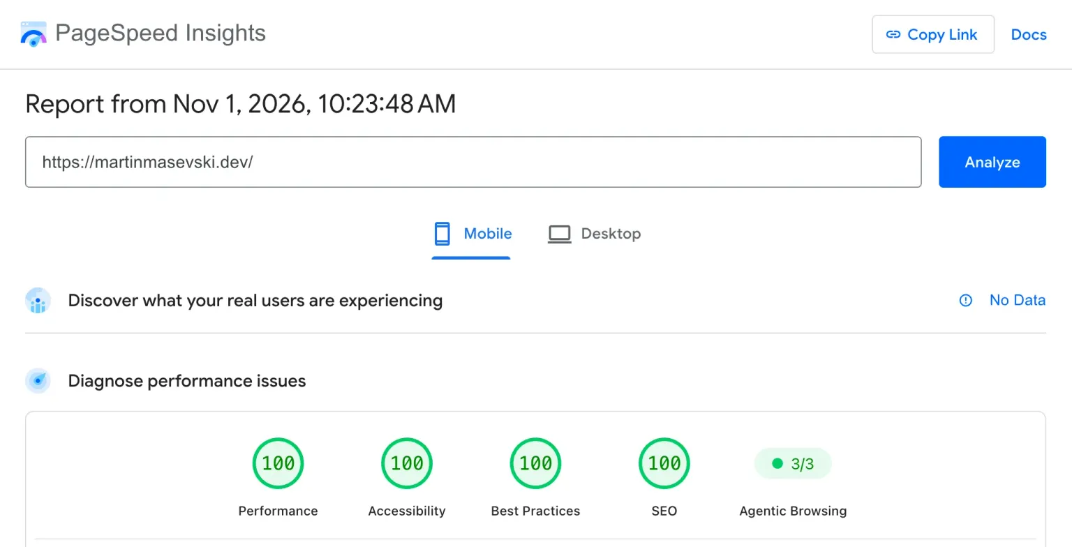
A perfect score is easy on a page with some text and nothing else. This one has a lot more going on: the hero is a grid you can play Game of Life on, the headline rotates, the corner shows how many people are on the site right now, and every article has a big illustrated cover. Some articles also have audio. On top of that there's a dark and a light theme, and the images switch with it: most covers and every screenshot in this post come in both versions.
This post covers what I built with Nuxt and Vue, and how all of it fits inside a 100.
Why Nuxt and Vue
I write Vue and Nuxt at my day job, and outside of it I'm a huge fanboy of both and of the community behind them. Picking them was easy. It also fits this kind of site, because Nuxt can render every page ahead of time.
It's the difference between a bakery that starts your bread after you order it and one that's been baking since dawn. At the second one, you walk in and the bread is already on the shelf. nuxt generate works like that: every page, every article and the RSS feed is baked into HTML at build time, so a visitor just picks up a finished file.
Most of the site is official Nuxt modules, configured in one nuxt.config.ts:
@nuxt/contentturns the Markdown incontent/blog/into pages. A zod schema checks every article's frontmatter, so a typo in a tag fails the build instead of shipping.@nuxt/imagemakes every image size and format at build time.@nuxtjs/seohandles the sitemap, robots, Open Graph images and structured data.nuxt-securitysets the Content Security Policy and the other security headers.@nuxt/a11yreports accessibility problems while I develop.@nuxt/uigives me components, and only ships the CSS for the ones I use.
The pages are served from Cloudflare Workers. The Worker is under 40 lines, and most of the time it just hands back the file.
The fun parts
A hero you can play with
Move your pointer over the hero and the squares under it light up and fade. Click, and the click seeds Conway's Game of Life, which runs for 90 generations and then fades out. The headline swaps its words every few seconds.
The Game of Life is there for a personal reason. I started programming in 2010, in my first year of high school, writing Pascal, and the Game of Life was one of the programs I wrote back then. I don't remember how I drew it anymore. It was probably characters printed in a terminal window. What I do remember is staring at it.
It's a strange kind of game, because nobody plays it. There are four simple rules about when a square lives or dies, and all you choose is where it starts. From those four rules come shapes that move across the grid, copy themselves and look... alive. Order and complexity grow out of chaos, right in front of you. Math, science and a pinch of philosophy, all in a grid of little squares.
I was mesmerized then, and I still am. Sixteen years later, putting those cells at the top of my own site felt right.
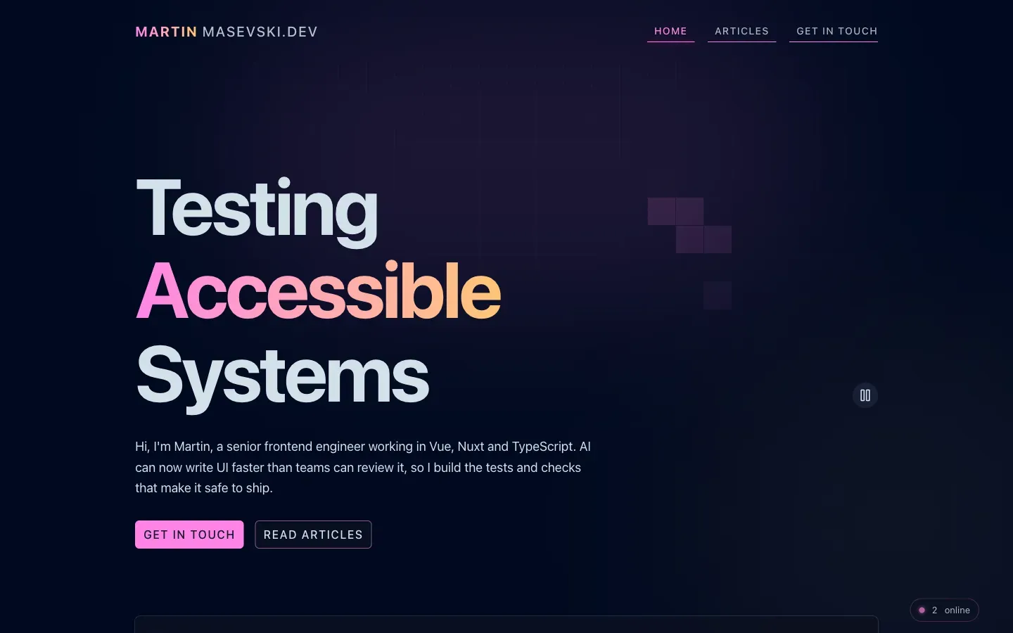 The hero after one click: a Game of Life pattern on the right, the pause button under it and the live visitor badge in the corner.
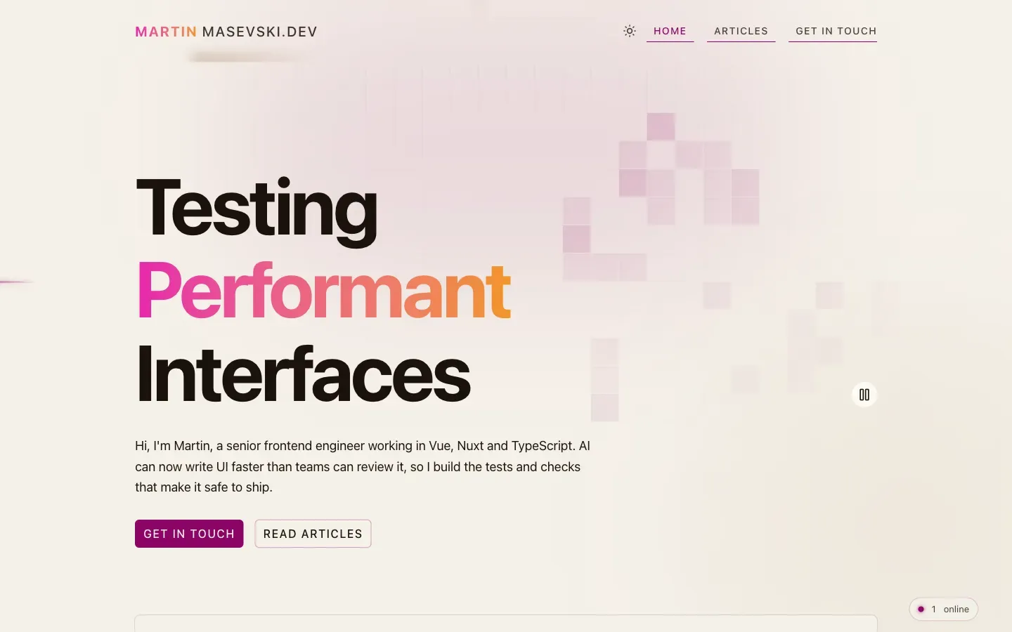
The rotating headline was the first accessibility trap. A screen reader would read every word change aloud, so the animated words are hidden from it, and the heading has a fixed text for screen readers instead.
Live visitors and likes
The "2 online" badge in the corner is real. I took the idea from Daniel Roe's site. Daniel leads the Nuxt team, and his site is a good place to see what Nuxt can do.
Mine runs on one small PartyServer on a Cloudflare Durable Object, which is like one tiny always-there server per room. The site has two kinds of room: one for presence, and one per article for likes.
- Presence uses a WebSocket. Your browser keeps a connection open to the room, and every time someone joins or leaves, the room sends the new count to everyone.
- Likes are plain HTTP requests to the article's room. Each visitor can like an article up to 10 times, so the room stores a count per visitor and a total.
Here's the shape of it, simplified from the real server:
// One class for every room. The room's name says what it's for:
// "site" for presence, "likes-<slug>" for an article's likes.
class Main extends Server {
  // Idle sockets sleep, so a quiet room costs nothing
  static options = { hibernate: true }

  // Presence: tell everyone the new count when someone joins or leaves
  onConnect() {
    this.broadcast(`connections:${countConnections()}`)
  }
  onClose() {
    this.broadcast(`connections:${countConnections()}`)
  }

  // Likes: add up to 10 per visitor, in one transaction so two clicks can't race
  async onRequest(req) {
    if (!isMyDomain(req.headers.get("origin"))) return forbidden()

    const visitor = visitorIdFrom(req)
    return storage.transaction(async (tx) => {
      const mine = (await tx.get(visitor)) ?? 0
      const total = (await tx.get("total")) ?? 0
      const added = Math.min(requestedLikes(req), MAX_LIKES - mine)
      await tx.put(visitor, mine + added)
      await tx.put("total", total + added)
      return { total: total + added, remaining: MAX_LIKES - mine - added }
    })
  }
}
The domain check stops another site from making its visitors' browsers send likes to mine. It won't stop a determined script that fakes everything, and for a like counter that's fine. The hibernation API is what keeps it cheap: when nobody is connected, the room sleeps and costs nothing while it waits.
Search that lives in the URL
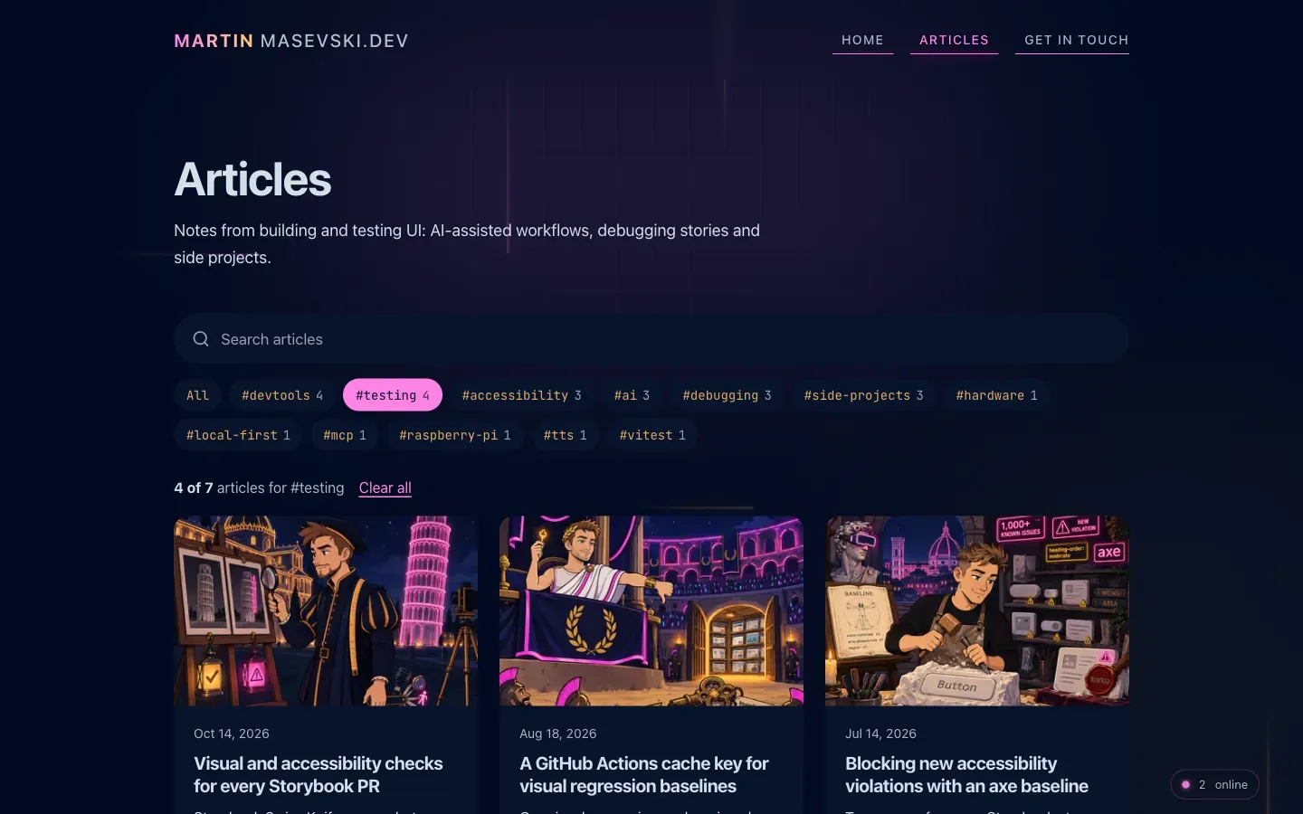 The Articles page with the #testing tag picked. The cards are filtered and the URL updates.
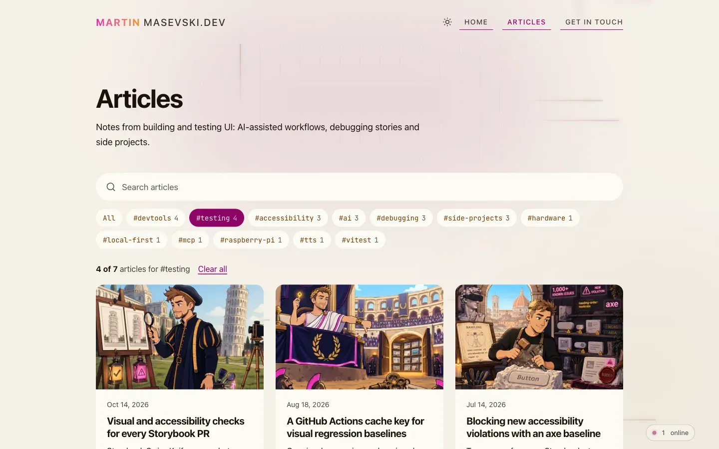
The search text and the selected tags are kept in the URL, so a filtered list is a link you can share. There was one catch: a prerendered page doesn't know the query string it was opened with, because it was built before anyone opened it. Nuxt's useRoute().query doesn't help at first either: the page wakes up with the route it was built for, which has no query, and only switches to the real one a moment later. So the search reads window.location once the page is in the browser.
Articles you can listen to
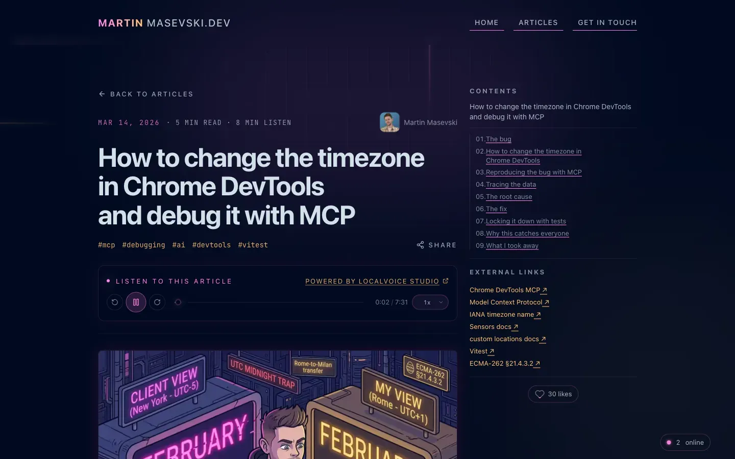 The audio player under the title of the timezone article. The narration was made with LocalVoice Studio.
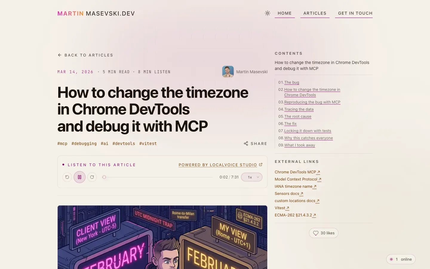
Some articles have a narrated version, stored in a Cloudflare R2 bucket. I made the narration with LocalVoice Studio, the browser text-to-speech app I wrote about before. The player has speed controls and becomes a small floating player when you scroll away. At build time the site checks whether each article has audio, and the player only appears when it does.
Small touches
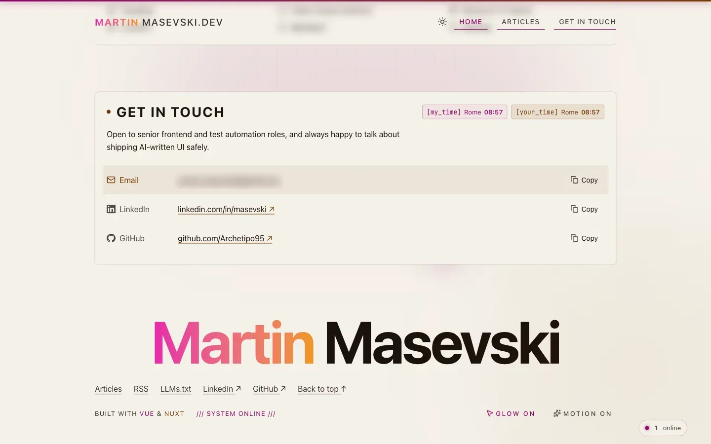
- A light theme, with daytime covers for some articles and light versions of the screenshots in this post.
- An optional cursor glow and a Motion toggle in the footer.
- My time in Rome next to your time, so you know if I'm asleep.
- An offline mode. A service worker saves the pages you read, so they open without a connection.
- A copy button and a wrap toggle on every code block.
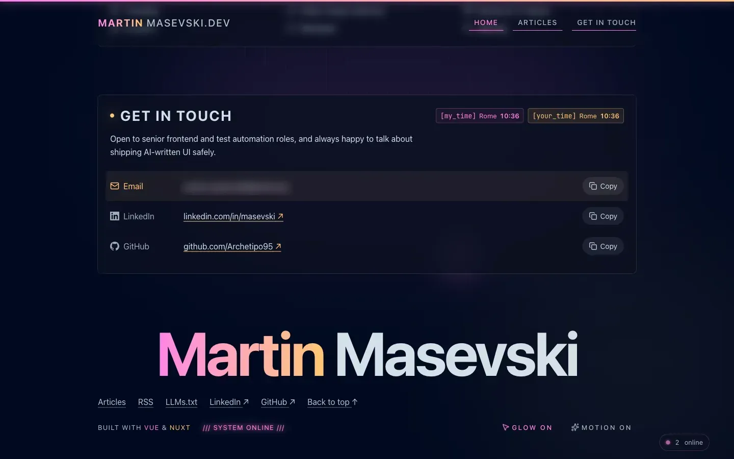 The footer with the cursor glow on, and the Glow and Motion toggles on the right.
How the animations don't cost points
Lighthouse mostly cares about one moment: how fast the main content shows up, and how busy the browser is while it does. Animations hurt when they run during that moment.
So nothing decorative runs then. It's like a shop that restocks shelves when it's quiet, not while there's a line at the register. Everything extra waits for the browser to be idle, using requestIdleCallback:
export function scheduleWhenBrowserIdle(task: () => void, timeout = 1000): () => void {
  // Safari only gained requestIdleCallback recently
  if (typeof window.requestIdleCallback === "function") {
    const idleId = window.requestIdleCallback(() => task(), { timeout })
    return () => {
      if (typeof window.cancelIdleCallback === "function") {
        window.cancelIdleCallback(idleId)
      }
    }
  }

  const timeoutId = window.setTimeout(task, timeout)
  return () => window.clearTimeout(timeoutId)
}
The live visitor badge, the like count, the audio player and the neon light-cycle effect after navigation all go through it. The article body uses Nuxt's lazy hydration too: it's in the HTML from the start, but its JavaScript only wakes up when it gets close to the screen.
Sections that slide in as you scroll share one IntersectionObserver instead of one each. A section that is already on screen when the page loads is left alone, so nothing you can see blinks. And without JavaScript the page still reads normally, because the server renders every section in place.
How the images don't cost points
The covers are the heaviest thing on the site. The trick is the same as a good waiter: bring the first dish right away, and the rest when you're ready for it.
- The first image is the only urgent one. It gets a high fetch priority and a preload in the
<head>. Every other image loads lazily, when you scroll near it. @nuxt/imagemakes AVIF and WebP copies of each image in several widths at build time, and the browser downloads the smallest one that's still sharp on your screen.- Every image has a width and height, so the text doesn't jump when it loads.
- Images and fonts are marked immutable, so a second visit doesn't download them again.
To pick a copy, the browser needs to know how wide the image will be on screen before it has laid out the page. That's what the sizes attribute tells it. I got it wrong on the article cover. I wrote it the way plain HTML does, with CSS media queries:
<template>
  <!-- Before: plain HTML syntax, which Nuxt Image doesn't read -->
  <NuxtPicture
    sizes="(max-width: 640px) calc(100vw - 2rem), (max-width: 1024px) calc(100vw - 6rem), 704px"
  />

  <!-- After: Nuxt Image's own breakpoint syntax -->
  <NuxtPicture sizes="96vw lg:704px" />
</template>
Nuxt Image has its own syntax for sizes: a width, then breakpoint:width pairs. Given the plain HTML version, it kept only the last value, so it told every browser the cover was 704px wide, even on a phone.
Phone screens pack more than one pixel into each CSS pixel. The phone Lighthouse pretends to be has 1.75, so a 704px image needs 704 × 1.75 = 1,232 real pixels. The nearest copy that big is 1408px wide, so phones downloaded a 75 to 100 KB cover. The new value matches the layout: on a phone the cover is 96% of the screen, and from the lg breakpoint up it's 704px. On that same phone, 96% of 412px is about 396px, times 1.75 is about 692 pixels, so it takes the 704px copy, which is about 40 KB. That's half the bytes for the image Lighthouse times the page on.
My favorite fix is in the Worker, the small script that sees every request before Cloudflare hands back a file.
@nuxt/image saves each resized copy at an address that says how it was made. /_ipx/w_320&f_avif/cover.png means "the cover, 320 pixels wide, as AVIF". The & in it was the problem. In a web address & has a special meaning, so Cloudflare stores these files under its safe spelling, %26. When the browser asked for w_320&f_avif, Cloudflare didn't send the image. It replied "that's at w_320%26f_avif", and the browser had to ask again.
It's like arriving at a building and being sent around to the side door. You get in, but you walk twice. Every image on the page did that walk:
- Before: the browser asks for
w_320&f_avif, Cloudflare redirects it tow_320%26f_avif, the browser asks again, and only then gets the image. - After: the browser asks for
w_320&f_avif, the Worker swaps&for%26and fetches the image itself, and the browser gets it on the first try.
On a slow phone connection, every extra trip is a wait the visitor can feel. The whole fix is a few lines:
if (url.pathname.startsWith("/_ipx/")) {
  // Static assets answer a path with "&" (as in /_ipx/w_320&f_avif/…) with a 307 to its "%26"
  // form, costing every image a round trip, so ask for the "%26" form directly.
  url.pathname = url.pathname.replaceAll("&", "%26")
  return env.ASSETS.fetch(new Request(url, request))
}
How I got the last six points
Until this week, only the home page was at 100. On a phone, the articles list scored 94 and an article scored 97.
On mobile, Lighthouse pretends to be a mid-range phone on a slow connection. The number that cost me points was Largest Contentful Paint: how long until the biggest image or block of text shows up. On a slow connection, everything that starts downloading before that moment shares the same bandwidth.
Think of the connection as a one-lane road, and the main image as an ambulance. It doesn't matter how fast the ambulance is if every car on the road is driving next to it. The fix was getting everything else to pull over.
Three things were in the way:
- The articles list loaded too many images. Cards 2 and 3 loaded their images straight away, because on a desktop they sit in the first row. On a phone they're far down the page. The other cards were lazy, but close enough to the screen that Chrome started them anyway. About 240 KB of card images raced the first one. Now only the first card loads right away, and the rest use
content-visibility: auto, so they wait until the page has painted. - Articles shipped code they didn't need. Every article downloaded the audio player and the mobile menu up front, even articles with no audio. Both are lazy components now. Nuxt also prefetched every lazy piece of JavaScript on first load, which I turned off with a build hook, so each piece loads when it's used.
- Around 50 scripts asked for high priority. Nuxt preloads the app's JavaScript files, and the browser treated all of them as urgent. A small server plugin now marks them low priority, so the main image and the stylesheet go first:
export function lowerScriptPriority(html: string) {
  return html.replace(
    /<(link rel="modulepreload"|script type="module")(?![^>]*fetchpriority)/g,
    '<$1 fetchpriority="low"',
  )
}
None of this is free. On a slow connection the page becomes interactive a little later, and the first click to another page can wait a moment for its JavaScript. I'm fine with that trade on a blog, where people mostly read.
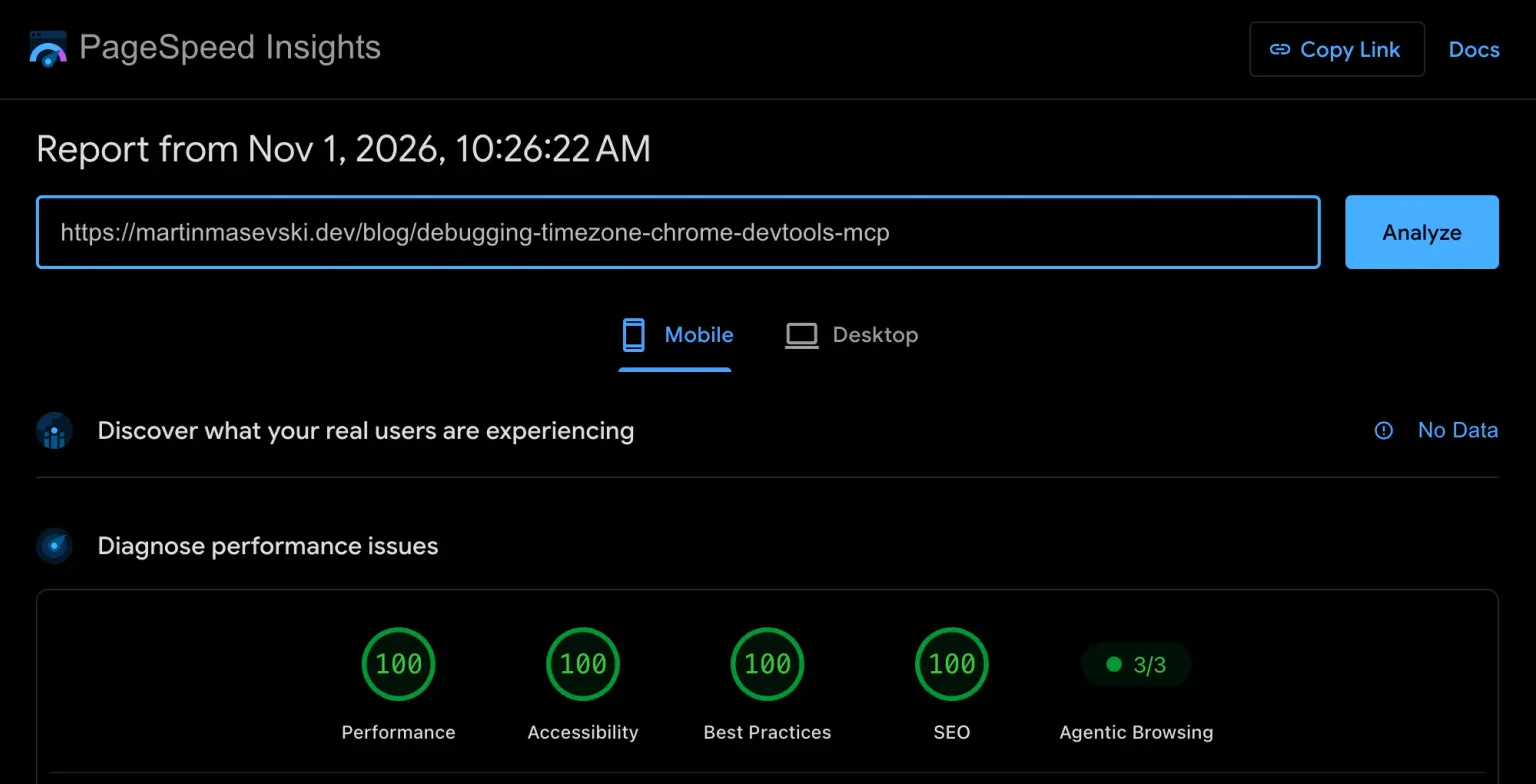
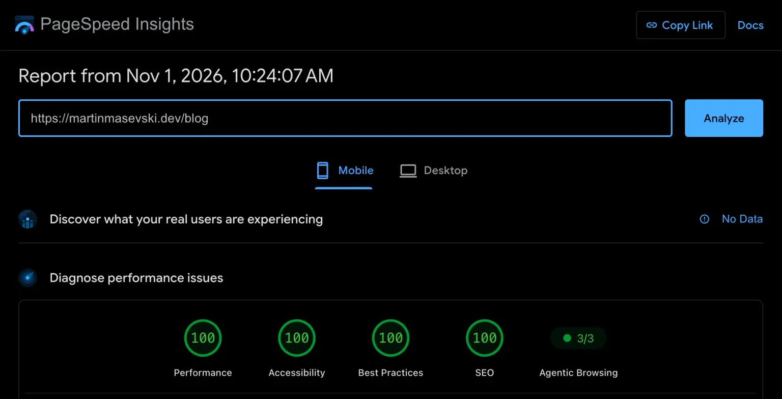 Mobile PageSpeed for the articles list after the fix: four 100s.
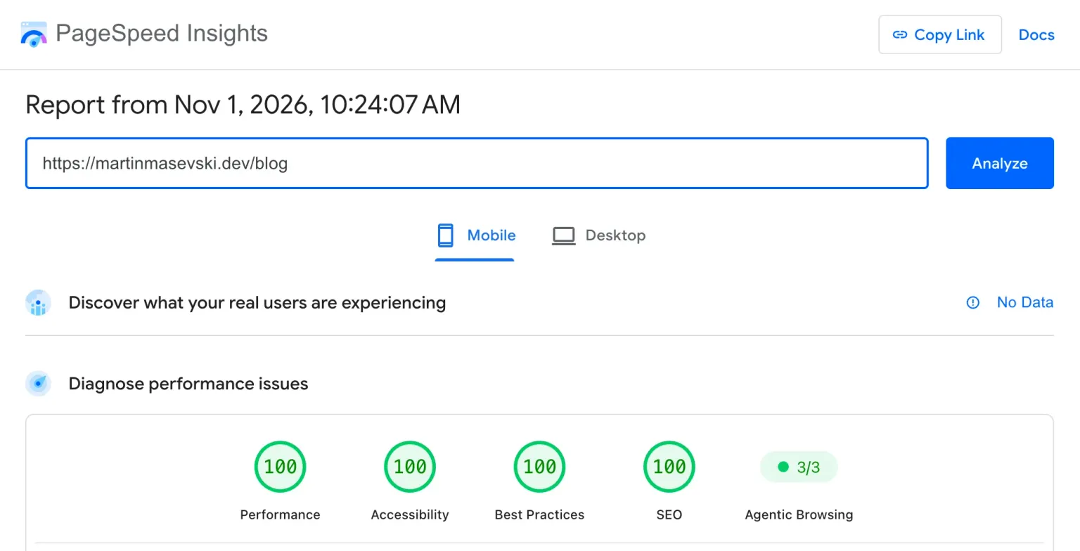
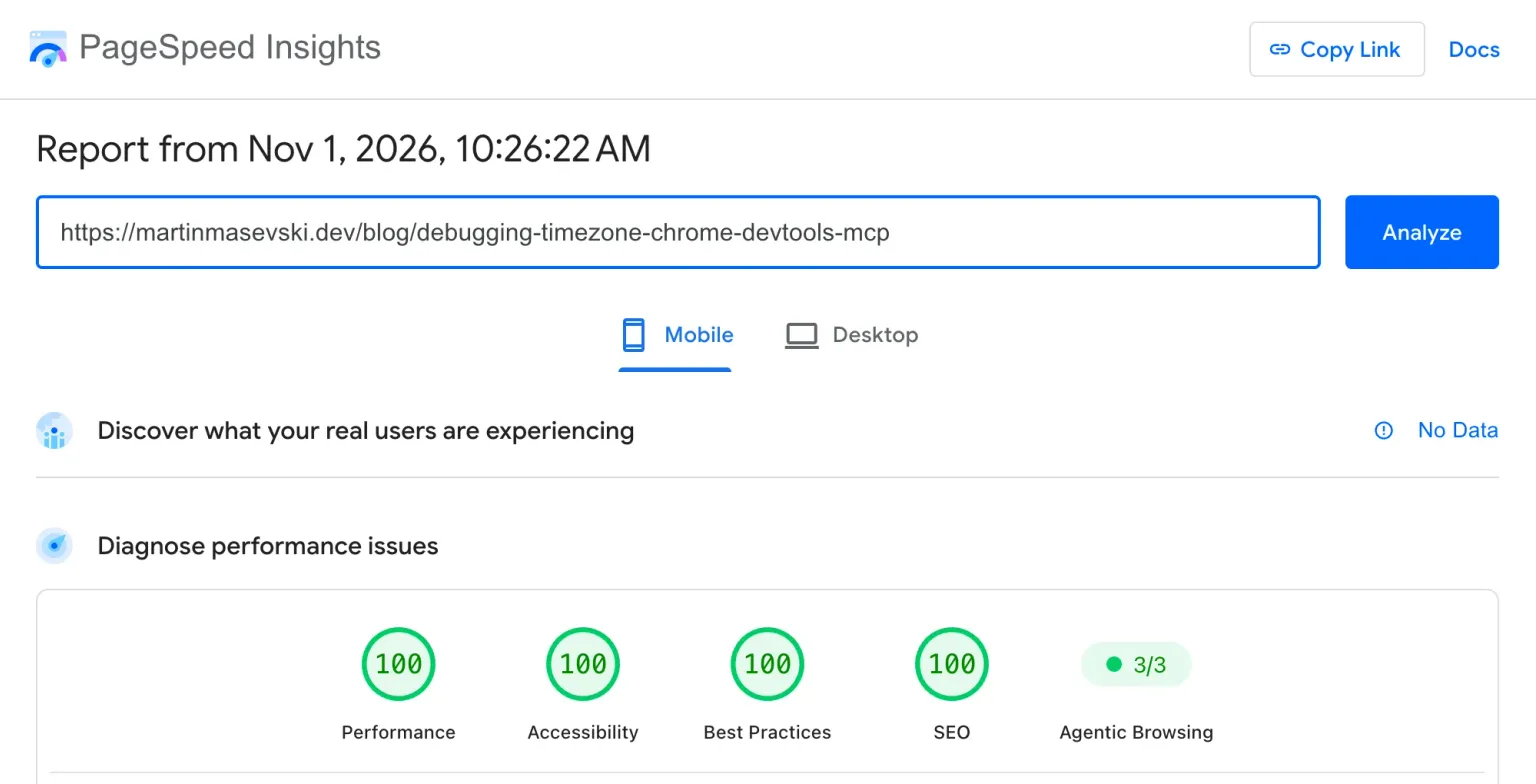
 Mobile PageSpeed for an article with an audio player: also four 100s.
How the light theme doesn't cost points
The site has a light theme now. Yesterday I wrote a whole article about it: the colors, the AAA contrast, the switch and the daytime covers. This part is only about speed.
A second theme can slow a site down in two ways: a flash of the wrong theme while the page loads, and a second copy of every picture.
The flash comes from prerendering. The HTML was built before you opened it, so it can't know which theme you picked, and it arrives in dark, the default. The color mode module puts a tiny script in the <head> that reads your saved choice and sets the theme before the browser draws anything. If you picked light, you never see a dark frame first.
The colors cost nothing extra. Every color on the site is a CSS variable, and the light theme is one block of CSS that gives those variables new values, so there's no second stylesheet and the components don't need to know a light theme exists. The circle that spreads the new theme across the screen uses the View Transitions API and only runs when you click, so it isn't part of loading at all.
The pictures took more thought. Think of a hotel room with a spare blanket in the wardrobe: it's there if you get cold, but nobody puts it on your bed unless you ask. Each article has both covers in the page, and CSS hides the one for the other theme. The daytime cover loads lazily, and a lazy image that's hidden never loads, so a reader in dark mode never downloads it. The screenshots in this post work the same way: each one has a light version, and you only download the ones for your theme.
There's one trade-off I made on purpose. The night cover is the main image Lighthouse waits for, so it's preloaded with high priority, and that preload starts before the page knows your theme. If you read in light mode, your browser downloads the night cover too, and then the daytime one. I kept it that way because dark is the default: it's what every first-time visitor sees, and it's what Lighthouse measures. That also means my 100s are dark-mode 100s. I haven't run Lighthouse in light mode, and with one extra cover to download, I'd expect it to score a little lower.
Accessibility beyond the score
Lighthouse's accessibility check catches the obvious things, like missing labels and low contrast. Most of the work it can't see.
Motion is the big one. The site follows prefers-reduced-motion, and the footer has a Motion toggle for people who never changed that setting. The toggle had a bug I like: its default value was written into every prerendered page as a cookie, so every full page load reset your choice. Now the cookie has no default, and your choice sticks.
The rest is smaller work done everywhere: visible focus outlines, and text for screen readers on the like button, the visitor badge, the audio speed and the time display. Every component has a Storybook story, and every story runs an axe check that fails the test on a violation, so a regression is caught before it reaches a page. Since the light theme arrived, every story runs twice, once in each theme.
SEO
@nuxtjs/seo does most of the work, and I mostly gave it the right data:
- The structured data describes me once, and every article points to that same person as its author. Google can connect the site, the home page and each post.
- Every article gets its own Open Graph image, rendered at build time from a Vue template, so nothing renders when someone shares a link.
- There's a sitemap, an RSS feed, an
llms.txtand a plain Markdown copy of every article, for readers and AI agents that don't want the HTML.
What a 100 doesn't prove
Four 100s don't mean the site is a great experience. They mean the site passed one test.
It's like a driving test. Passing proves you drove well on that route, on that day, with an examiner watching. It doesn't prove you're a good driver at night, in the rain, with a kid screaming in the back seat.
Lighthouse is the same kind of test. It loads one page, once, on a simulated phone. It doesn't see what happens when you scroll, click a filter or open a second page. Under the scores, PageSpeed has a section for what real visitors experience, and for my site it says No Data, because there aren't enough visitors yet for Google to measure.
The score can also be faked. A site can spot the Lighthouse browser and send it a stripped-down page, or skip the slow parts until someone moves the mouse. An empty page scores 100 too. The accessibility score only covers the checks a machine can run, so a page can get 100 and still be confusing with a screen reader.
So I treat 100 as a baseline: the same test every time, so I can tell when a change makes things worse. What I want is a site that feels fast and works for everyone, and the score is one way to check I haven't drifted from that.
How it stays at 100
A baseline only helps if I check it. Every pull request runs Unlighthouse on desktop and mobile in GitHub Actions and posts the scores as a comment. Unit tests sit next to almost every component and composable, Storybook stories run as browser tests, and Playwright covers the main flows end to end. When CI can't run, I run the same checks locally before I deploy.
What I took away
I kept every animation and changed when they run. The browser has one busy moment, when it first shows you the page, and anything that isn't the page waits until that moment is over: the first image loads now and the rest later, the hero renders first and the Game of Life starts after.
Nuxt made most of this a setting rather than a project. Prerendering, image sizes, lazy hydration, structured data and security headers are all modules or a few lines of config. That left me time for the fun parts, like a Game of Life nobody asked for.
The cover is Skopje. I was born in Macedonia and grew up in Italy, and Skopje is the city where old and new sit right next to each other. On one side of the river there's the old bazaar and the fortress, on the other glass buildings and neon. That's how this site is built too. The tools are new, but what makes it fast is old and simple: finished HTML files, images at the right size, and nothing running before it's needed.
Keep reading
Turning a neon dark site into an accessible light theme
My site was dark only, all neon pink and gold. Adding a light theme meant new colors that pass AAA, a switch that remembers you, a reveal animation and daytime covers.
Also about #accessibility #side-projects
Nov 1, 2026
newVisual and accessibility checks for every Storybook PR
Storybook Swiss Knife screenshots every story, compares it with the base branch and runs axe on every PR. Here's what made those checks trustworthy.
Also about #accessibility #side-projects
Oct 14, 2026
Storybook PR previews on GitHub Pages without trusting PR code
Why pull_request_target is the wrong tool for PR previews, how I split build and publish with workflow_run, and three bugs that still broke previews.
Also about #side-projects
Sep 24, 2026