
Turning a neon dark site into an accessible light theme


This site was born at night. Deep navy background, neon pink and gold, little glows around the buttons. I liked it, and I still do. But some people read better on a light page, especially long articles in the middle of the day, and their screen or their eyes should decide that, not my taste.
I thought adding a light theme would take an afternoon: swap a few colors, add a button. It took much longer, and most of the time went into color.
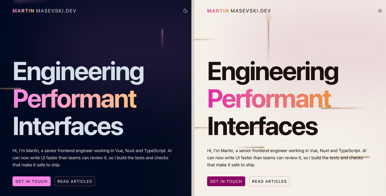 The homepage at night and by day. Same layout, every color picked again.
Why you can't just flip the colors
Think of a neon shop sign. At night it's the brightest thing on the street. Hang the same sign in the midday sun and you can barely tell it's on. The sign didn't change. What's around it did.
My accent colors had the same problem. The neon pink is very light, which is exactly why it glows on navy. On a light page it almost disappears.
The quick fix most developers think of first is a CSS filter that inverts the whole page. It does turn the navy pale, but it also turns my pink into green and every photo into a negative. It swaps the colors for their opposites instead of finding the right ones for daylight.
Designers measure this with a contrast ratio: how much lighter one color is than the other, from 1:1 (identical) to 21:1 (black on white). The accessibility guidelines (WCAG) ask for at least 4.5:1 for normal text, which they call level AA, and 7:1 for the stricter level AAA. You don't need a special tool to check: browser DevTools show the ratio when you inspect a color, and that's how I measured every number in this article.
Here is what my dark theme's colors score on its navy, and what the same colors would score on a light page:
| Color | On navy | On light paper |
|---|---|---|
Neon pink #ff83e6 | 9.06:1 | 1.94:1 |
Gold #ffc672 | 12.77:1 | 1.37:1 |
Both drop from AAA to unreadable, so every color needed a light version of its own.
The top half of the screenshot below is an article header where I only flipped the background and the text, and kept the dark theme's accents. The bottom half is the finished light theme. Look at the date and the tags: on top they almost vanish into the paper.
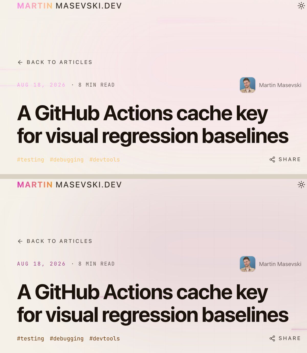 Top: the dark theme's accents on paper. Bottom: the light theme's own accents.
Studying the colors
Before choosing, I wanted to see the options on the real site, with real articles, not in a design tool. So I built a throwaway panel that floated over the page and swapped the colors live: a few backgrounds, the two accents swapped around, pickers to edit any color by hand. I clicked through it on the homepage, the blog and a long article.
A few things settled quickly.
The background is paper. Pure white next to my pink and gold looked clinical. A warm off white, like the page of a paperback, kept the mood of the dark theme. I tried a cooler stone gray too, and the warm paper won.
I write the colors in OKLCH, a format that describes a color by how light it is, how strong it is and which hue it is, as three separate numbers. That made the accents easy to adjust, because I only wanted to change one of the three.
The more familiar HSL format has a lightness number too, but it doesn't match what your eye sees: a yellow and a blue at the same HSL lightness look nothing alike in brightness. Evil Martians explain it with examples. OKLCH's lightness is measured the way we see it, so lowering it gives the same color, just darker. All the major browsers have supported it since 2023.
To make the pink readable on paper, I kept its hue and turned the lightness down from 80% to 43%. It's the same pink, just in ink instead of light.
The first readable versions passed AA, and I pushed them to AAA, 7:1, because most of my pages are long text, and the people who need a light theme are often the ones who need the extra contrast.
Then I hit a wall. Dark pink and dark gold are readable, but they're also a bit sad. The whole personality of the site was the glow.
The trick I borrowed from the Vue docs
The Vue docs have a bright green to blue gradient on their homepage title, on a white page. It shouldn't work, because those colors are far too light to read as text. And yet it looks great.
The trick is that they split color into two jobs. The big gradient is decoration, like a logo: it's huge, it's short, and you'd recognize it even if you couldn't read it. All the text you actually read uses darker, readable colors.
It's the difference between a highlighter and a pen. You highlight with a bright yellow, but you'd never write a letter in it.
I did the same:
- My logo and the big gradient headings keep the neon: a vivid pink to gold gradient, close to the dark theme's colors.
- Links, dates, tags and every accent you read use the darkened pink and gold.
- The glows go away. A glow is light spilling out of something bright. On paper there's nothing to spill, so it just looks like a smudge. In the light theme the shadows and halos are switched off.
In CSS, the whole light theme is one block of overrides. The site's colors are variables, so the components didn't need to know a light theme exists:
:root.light {
  color-scheme: light;
  --color-cyber-bg: oklch(96% 0.012 85); /* warm paper */
  --color-cyber-text: oklch(19% 0.02 60); /* dark brown ink */
  --color-cyber-neon: oklch(43% 0.18 345); /* pink, as ink */
  --color-cyber-warm: oklch(41.5% 0.1 55); /* gold, as ink */
  --gradient-from: oklch(63% 0.25 345); /* the decorative gradient stays vivid */
  --gradient-to: oklch(75% 0.16 65);
}
The numbers
Measured on the paper background:
| Color | Used for | Contrast | Level |
|---|---|---|---|
Ink #1b120b | Body text | 16.48:1 | AAA |
Pink #8d0466 | Links, accents | 8.00:1 | AAA |
Gold #743a04 | Dates, tags | 7.97:1 | AAA |
Gradient pink #e724ab | Big headings only | 3.56:1 | Large text AA |
Gradient gold #f29520 | Decoration only | 2.05:1 | Decoration |
The gradient's pink end passes for large text, and its gold end doesn't pass at all. It only ever appears at the end of a big gradient heading, where the word is already readable from its pink start and its size. That's the Vue trick, and it's a judgment call, so I'd rather show the number than hide it.
Then I stopped trusting my table and checked the whole site. An axe scan of every page in both themes found more small text under 7:1 than I expected: labels in gray at 60% opacity (4.65:1 on paper), dates and code labels in faded pink (4.81:1 on navy), table headers, the copy button on code blocks. All of it passed AA, so nothing was broken, but "mostly AAA" isn't what I wanted to write here.
So now faded gray never goes under 75% (7.74:1 on paper, 8.02:1 on a navy card), small pink text is always at full strength, and the scan finds nothing on any page in either theme. The labels are a little brighter than before, and still clearly quieter than the body text.
One spot the scan can't judge, because axe doesn't measure text on a gradient: the selected role in the work log on my homepage, which uses the vivid gradient as its background. Dark text on its pink end is 4.60:1. On a desktop screen the label is large bold text, where AAA asks for 4.5:1, so it passes. On phones and tablets the label has to stay small to fit its bar, so there it's AA.
The code blocks
Code was its own small project. The syntax highlighter, Shiki, colors code with ready-made themes, and you can give it one theme per color mode. I picked GitHub's high contrast light theme for the light mode.
Except my light theme didn't show up. The code blocks were still in a pale theme I'd never chosen. It turned out the Nuxt Content module has its own default for light mode, and because I'd only set "default" and "dark", its default filled the gap. Naming the light theme explicitly fixed it.
Then the comments. In both themes they sat just under 4.5:1: 4.47:1 on paper, about 4:1 on navy. Comments are the part of a code sample that explains it, so they had to go up, and while I was there I went for AAA on every token. I made copies of both themes and lifted each color under 7:1 by the least it needed, keeping its hue. Five colors changed in total: the comments are now 7.16:1 on paper and 7.49:1 on navy, and Palenight's red for property names went from 6.89:1 to 7.20:1. A unit test checks every token of both themes against the page, so a theme update can't bring a faint one back without me noticing.
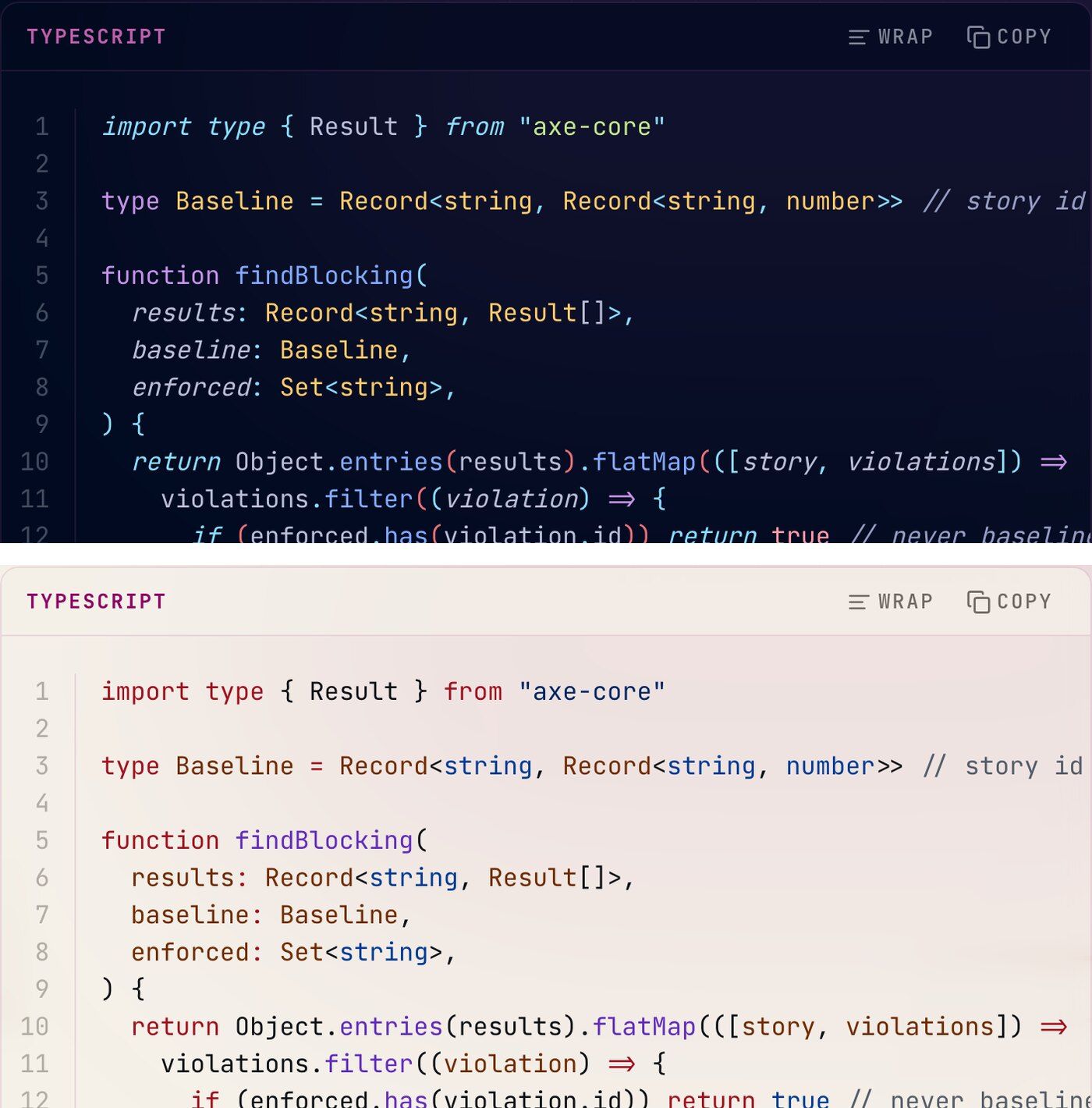 The same code block in both themes. The comment on line 3 stays readable in each.
A switch that remembers you
Dark stays the default, even if your phone is set to light mode. It's the site's identity, and I want first time visitors to meet it the way it was made. One click switches to light, and your choice is saved in the browser, so the next visit opens the way you left it.
It also doesn't flash. A tiny script that the color mode module puts in the page head reads your saved choice and sets the theme before the browser draws anything, so if you picked light you never see a dark frame first.
I started with a dropdown menu with three options: dark, light and system, which follows your device. It worked, but two clicks to change something you change often felt like too many. So I made it one button that cycled through all three, and that showed the real problem: "system" is a word for developers. Someone who clicks the sun wants a light page, and a third state that sometimes changes nothing just looks broken.
Now the button has two states, with an icon for the current one. Its label tells screen readers both what it is now and what the next click does: "Theme: Dark. Switch to Light".
A small detail I like: the color of the browser bar on phones follows the theme too. Navy in dark, paper in light, so the page doesn't end in a stripe of the wrong color.
The animation
Switching theme in one frame felt like someone flipping the lights on in a dark room. So the new theme spreads out from the button as a growing circle, until it covers the screen.
The browser does the heavy lifting with the View Transitions API. When you click, it takes a snapshot of the page as it is, applies the new theme underneath, and lets you animate between the two. Picture a photo of the old page laid over the new one, with a hole cut in the photo that grows from the button outward.
In this frame, caught a fraction of a second after clicking, the light theme is growing out of the sun icon in the top right corner, and the dark page is still showing everywhere the circle hasn't reached yet.
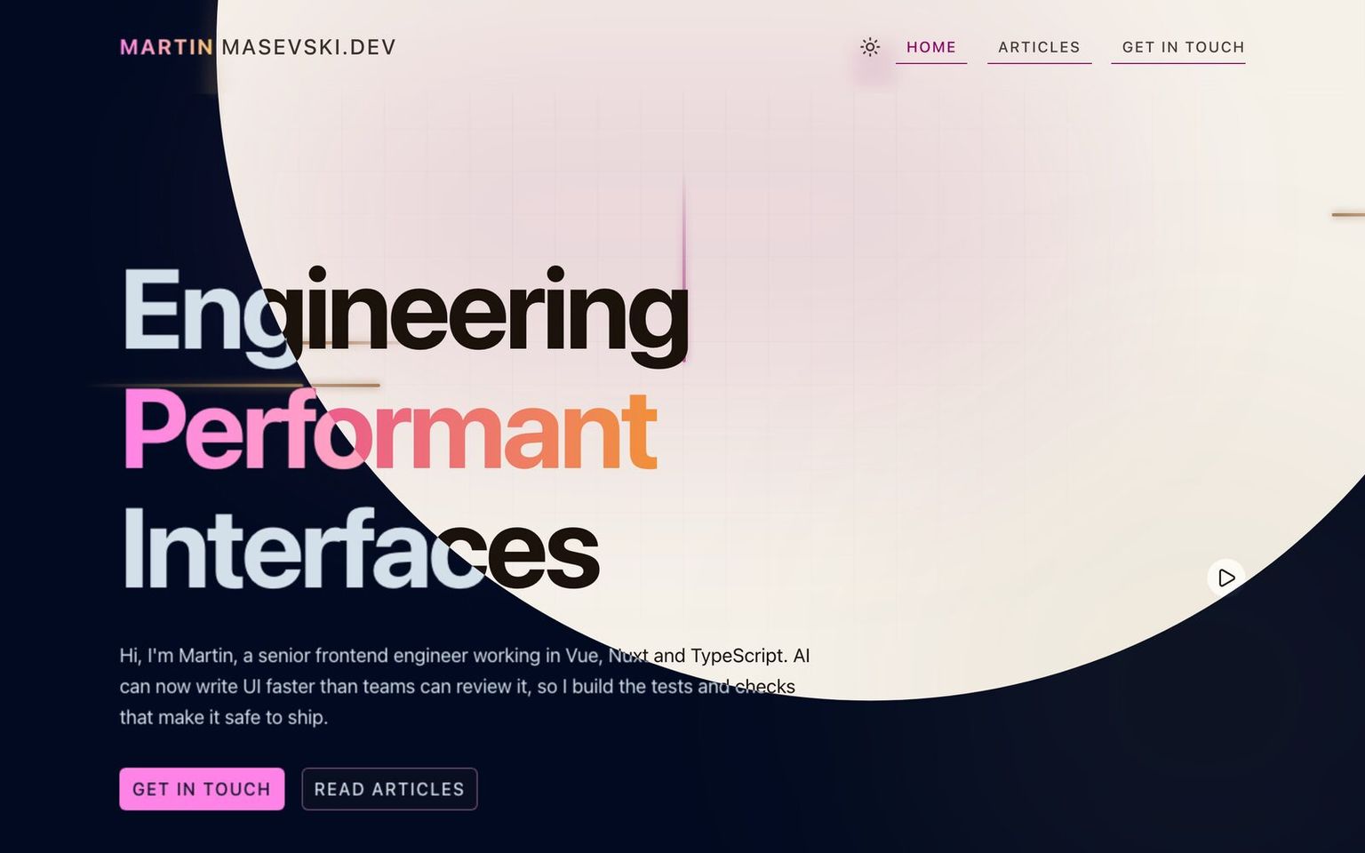 The switch caught halfway: the light theme opens as a circle from the theme button.
const transition = document.startViewTransition(swap)
transition.ready.then(() =>
  document.documentElement.animate(
    { clipPath: [`circle(0px at ${x}px ${y}px)`, `circle(${radius}px at ${x}px ${y}px)`] },
    {
      duration: 600,
      easing: "cubic-bezier(0.16, 1, 0.3, 1)",
      pseudoElement: "::view-transition-new(root)",
    },
  ),
)
x and y are the center of the button, and radius is the distance to the furthest corner of the screen, so the circle always covers everything. The easing starts fast and lands gently, so the circle seems to fly out from the button.
Many elements on the site fade their colors on hover. During a theme change those fades started all at once, after the circle, so half the page finished changing a moment later than the other half. Now those transitions are turned off while the theme switches.
The circle also respects reduced motion. If you've asked your device for less motion, or turned motion off in the site's footer, the theme simply changes with no circle. Older browsers without View Transitions get the instant change too. The button's icon also does a small spin from moon to sun, and that follows the same rule.
Testing both themes
A light theme doubles the number of pages you can break. I check accessibility with axe, through Storybook's accessibility tests: every component has stories, and every story is checked for problems like low contrast.
Now every story runs twice, once in each theme. A failure tells you which theme it was in.
The setup is smaller than it sounds. Vitest can run the same tests as several projects, so I made two Storybook projects that differ by one constant, and Storybook's preview reads that constant to pick the theme:
// vitest.config.ts
const storybookProject = (theme: "dark" | "light") => ({
  plugins: [storybookTest({ configDir: ".storybook" })],
  define: { STORYBOOK_THEME: JSON.stringify(theme) },
  test: { name: `storybook-${theme}`, browser: { enabled: true /* … */ } },
})

export default defineConfig({
  test: { projects: [storybookProject("dark"), storybookProject("light")] },
})
The first light run caught a real bug straight away: the audio player's time ("0:00 / 0:00") was 3.97:1 on paper, too faint to pass. A later round of stories found another one hiding in both themes since long before: the "No sections found" message in the contents drawer, faded to 2.53:1 on paper and 3.05:1 on navy. Nobody had ever rendered that empty state in a story.
There was a scary moment too. My first version of the two runs passed everything in light mode, which looked too good. I added a test that printed the theme it was running in, and it said "dark". The light run had been checking the dark theme the whole time, like a smoke alarm with no battery: quiet, and useless. Passing the setting in a different way fixed it, and that's when the real failures above showed up.
Bonus: daytime covers
Every article has a cover illustration, all of them made with AI, and they were all night scenes: neon lit workshops, a Colosseum under the stars, Venice at night. In the light theme they looked like holes punched in the paper. Brightening them with a filter didn't help: a brighter night scene is still night, with the same black sky and glowing signs, only washed out.
So each cover now has a daytime version: the same scene, the same props, in sunlight.
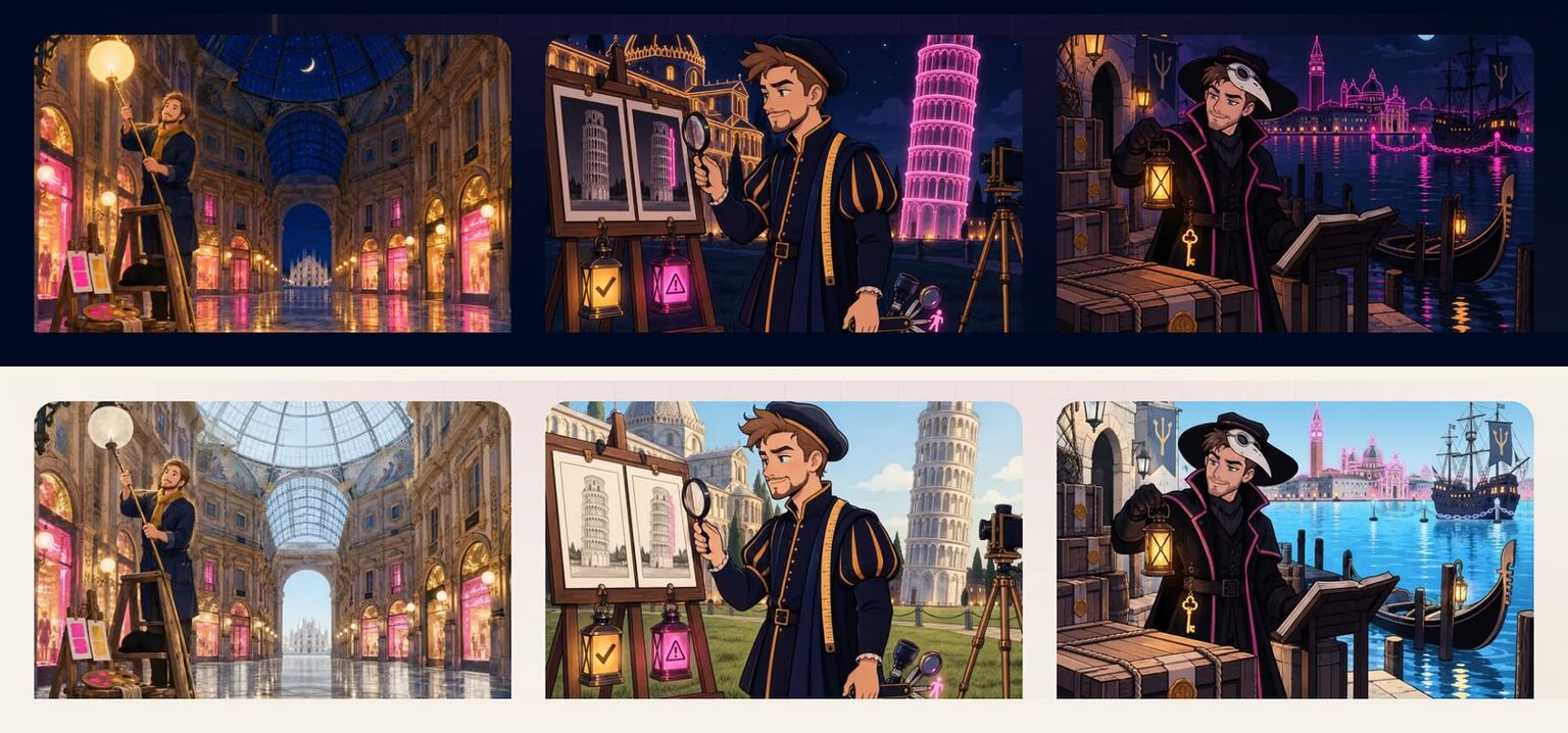 Three covers at night and by day.
My first attempt was to have an AI image tool redraw them from a text description. The scenes came out well, but they weren't the same scenes. The tool only gets a description, not the original picture, so the main character came out as a different person on every cover. A cover is more like a series than a single image, and the series needs the same face.
What worked was giving the AI the original cover itself. I selected each one in Figma, used Edit image with AI and asked for a daytime version. With the picture to work from, it kept the drawing and only changed the light. I used the results as they came out, without editing them. I keep both versions side by side in Figma, a dark board and a light board, with a placeholder for every cover that doesn't have a daytime version yet.
On the site, an article lists its daytime cover next to the night one:
image: /images/blog/visual-regression-baseline-cache-key.png
imageLight: /images/blog/visual-regression-baseline-cache-key-light.jpg
Both images are in the page, and CSS shows the one for the current theme. The night cover is the default, so it's the one the browser fetches first. The daytime one is set to load lazily, and a lazy image that's hidden doesn't load at all, so someone reading in dark mode never downloads it. Switch to light and it loads the moment it appears.
export function articleCovers({ image, imageLight }: { image?: string; imageLight?: string }) {
  if (!image) return []
  if (!imageLight) return [{ src: image, isLight: false, class: "block" }]
  return [
    { src: image, isLight: false, class: "block light:hidden" },
    { src: imageLight, isLight: true, class: "hidden light:block" },
  ]
}
Articles without a daytime cover yet simply keep the night one in both themes, so I can add them one at a time.
One last surprise: the first daytime files I exported from Figma were about 2 MB each. Figma had redrawn each 1200 pixel image to fill a 1280 pixel frame and saved it as a PNG, which made it bigger without adding any detail. The originals inside Figma were high quality JPEGs of about 300 KB. Same picture, a seventh of the size.
What I took away
Each color in the theme has a job, and the job decides how dark it is. Decoration can be loud, text has to be readable, and the two shouldn't share a color just because they share a hue.
And test the thing you think you're testing. A green check from a test that never saw the light theme is worse than no check at all, because it stops you from looking.
Keep reading
Visual and accessibility checks for every Storybook PR
Storybook Swiss Knife screenshots every story, compares it with the base branch and runs axe on every PR. Here's what made those checks trustworthy.
Also about #testing #accessibility #side-projects
Oct 14, 2026
How I built this site with Nuxt and Vue and kept Lighthouse at 100
The Nuxt and Vue setup behind martinmasevski.dev, the features I had fun building, and how it scores 100 on Lighthouse with animations and images on every page.
Also about #accessibility #side-projects
Nov 4, 2026
newBlocking new accessibility violations with an axe baseline
Turn on axe for every Storybook story without freezing releases: record known violations in a baseline and fail PRs only on new or worse ones.
Also about #accessibility #testing
Jul 14, 2026